Understanding kangaroos’ low-methane flatulence could help researchers lower greenhouse gas emissions from livestock.


Kim was honored to be a surprise speaker at Visualized 2014 in NYC recently. A conference about storytelling and data, Kim rocked the boat by calling for rethinking our mania with storytelling. Here’s a quick recap of Kim’s talk:
—
 I used to be embarrassed by numbers, for my love of numbers. I grew up in a small town in the Midwest. When I was 8 or 9 I got this awesome Christmas gift — a calculator. (Notice that no one else in my family is posing with a gift… that’s just how elated I was.) But it wasn’t just any calculator. It was called the Quiz Kid by National Semiconductor — and it was AWESOME! It didn’t give you answers; you had to put in the equation AND provide the answer. It would blink it’s green eye for correct, and its red eye for incorrect. That’s just how nerdy I was even at an early age.
Later on, in junior high, I joined the math team. Now, there’s not much sexier when you’re 16 than joining the math team. What’s worse is they call you “mathletes” which is just sad because they’re trying to wedge smarts into athletics to apparently make it more appealing. It’s just degrading. I also became the “stat girl” for our high school wrestling team (state champs year over year), so this was a prestigious role. I got to note every wrestler’s weight, every take down, every half nelson, every pin, every freaking move. It was awesome. I loved it. Now, again, this is a small town in the Midwest, so not much was done to nurture this *weird* fascination with sports stats…. Now Nate Silver has my dream job of “stat girl.”
Later on, I went to university and got my Computer Science degree. I met more people like me… mathy people… nerdy people. I did various types of programming and eventually got into data visualization… and now I’ve truly found my people.
But I realized there are lots of numbers people, not just in science and math. Numbers help us understand the world; they help us understand how we fit into it… what we can get out of it. They help us relate to one another, and help us understand if things are fair or not.
We recently showed our gun violence viz at a Film Fest about Gun Violence (who does that?? Portland Oregon does that). So there were some really personal stories, beautiful interviews, documentaries… then punctuated with our very stark visualization of all the gun homicides in the US. And people were like “whoa” … and a lot of people talked to me afterward – now these were normal people, not dataviz people, and they told me they were surprised by how much it resonated with them.
And I think it’s because it’s fine to have our heart strings tugged by a personal story – stories feel familiar to us. But then we wonder how this fits into the big picture, what sample size this represents.

 Because stories leave us up here at the top of the pyramid. No one can see what went into that story. They don’t know all the things that formed the structure of the story or the research that was done or how it was conducted. And data visualization can bring us further down that pyramid so people can get a better sense for what this story is really all about.
Now, I’m speaking mostly to the journalists with those slides. But I want to go off-script on a rant here. I *hate* (and I don’t like to use the word hate), but I *hate* this mania going on about storytelling with data. If it’s your job to tell stories, then great. But you don’t need to tell stories. It’s flourish. It’s a veneer… A sheen that can draw skeptics. Because now they have to decide whether they believe your story or not.
Now people will argue that Periscopic’s work has storytelling in it. That’s true, my business partner, Dino, is great at storytelling. He’s a writer! And it works for some things when you need to walk someone through a lot of complicated subject matter. But people who claim that say our gun killings piece had storytelling, I argue that it doesn’t. It’s emotive. It’s dramatic. But I don’t feel like it’s storytelling. And I’m not saying this to bash the topic. I’m saying it because I’m FILLED with anxiety when asked to tell a story. Hey, I’m Miss Non-Fiction here! I don’t swing that way. My two boys used to ask me to tell them a story… I was like “once upon a time… there was a girl… who wore glasses.” they’ve totally given up on me. It causes me great stress… And I know that storytelling is finding its way into job descriptions which makes me sad because you are probably missing out on some great people.
To me, if we get too much into storytelling, we run the risk of obfuscation.
Sometimes all it takes is a bar chart. Ok. I said it. You can ask any of the viz superstars if they’ve ever made a bar chart and they will sheepishly have to admit “yes, I’ve made a bar chart.” And they’ve probably made lots of them. They hide them away because they’re not pretty. They don’t necessarily tell a story. They’re like… “Once there was a bar chart….. who was a girl…. who wore glasses….”
The reason data visualization is important isn’t because we can tell stories. It’s because our puny brains suck at numbers (even if we’re numbers people).
 Cognitively, our mental number line represents numbers with decreasing accuracy. The larger the quantity is, the fuzzier our mental representation of it. This diagram shows how our brain functions when it encounters a number. The larger the number the wider the range of activation. Essentially our understanding of that number leaking into the surrounding numbers.
Data visualization really resonates for some people because they have that “latent” number sense… And now they’ve found their people.
And because we stink at numbers, we need decoders of information. Us.
The be autiful and hilarious Data Stories podcast had a recent episode with Marian Dörk, a professor at Potsdam University. Marian coined the term Information Flâneur.He was repurposing the French term “flâneur” which refers to a gent who wanders around the city making observations. Essentially someone who observes the silos of commerce, culture, infrastructure, politics, etc. and synthesizes the concepts into a holistic view of the city. This was a person who often had a creative pursuit such as writing, painting, or the like. They were able to use these creative outlets as ways of communicating their ideas about the city.
Now I think Marian was referring to the end-user of a visualization, but I like to think of all of us as data flâneurs. We wander around the data, often synthesizing disparate sources, making observations, making connections, and ultimately making sense. We are a privileged group – people who can make these observations, and people who can creatively output those observations as sense-making.
Let’s embrace the title of Data Flâneur and bring understanding to the world.
For the slides – head to the end of this post
For Tableau-versions of the vizzes, head to this post
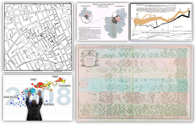
What do you think are the most influential visualisations of all time? I asked that at SXSW today: what a great time it was delivering the session to everyone. If you want to watch the session again, you can watch an older version I recorded with Data Science Central.
I’ve also uploaded the Tableau workbook I used to recreate the visualisations (see this post). This in itself was an interesting exercise. Do they look better in a modern data visualisation tool? I don’t think so (as you can see in my exploration of Nightingale’s chart earlier this week). What the originals have is the depth of the personal touch. Being hand-drawn they contain the soul of the author of the viz. Each dot of ink will have been considered carefully:
- What layout will best communicate my message?
- Should I use colour?
- What thickness should the axis be?
Today, not enough people stop to take the time to make those considerations.
My slides are also available on slideshare. And if you want to go do some further reading, I have a bundle of links on Bitly.
I’m interested to know what you think of my choices and if you would choose different ones.
 Interviewing President Obama on the online comedy show “Between Two Ferns” on Tuesday, Zach Galifianakis deployed his signature rude barbs.
